Two iterations of commercial design:
Framebridge
Retail Stores
The frame store of the future.
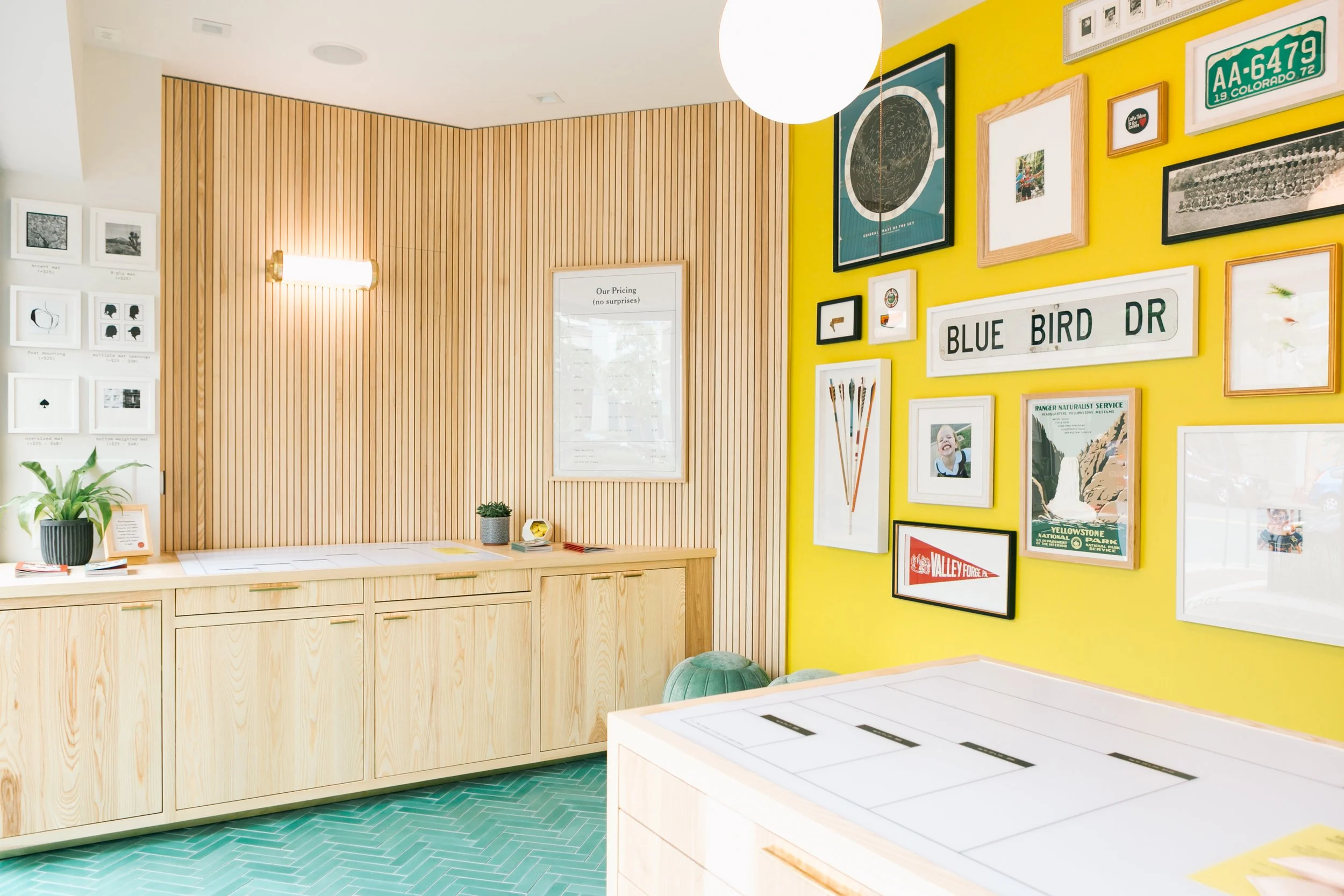
Framebridge opened its first two retail stores in 2019, five years after launching online. The brand reimagined how a framing studio could look and feel, aiming to create a light, fun, new-school experience that was nothing like the stuffy, overwhelming frame shops of the past. As the in-house Creative Director and Head Merchant, Tessa led design, FF&E sourcing, and visual merchandising, and partnered with Architects, GCs, and local construction team for buildout.
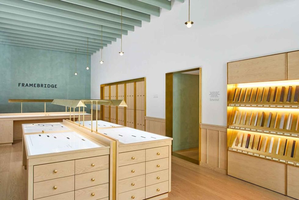
Soon after, Framebridge was poised for rapid retail expansion. In late 2019, Tessa led a design RFP process and hired Studio Tack (now Post Company) to help develop a high-end, but scalable design that could be executed across markets consistently. This allowed Framebridge to open new doors rapidly, and this on-brand design is used across all 19 current locations.
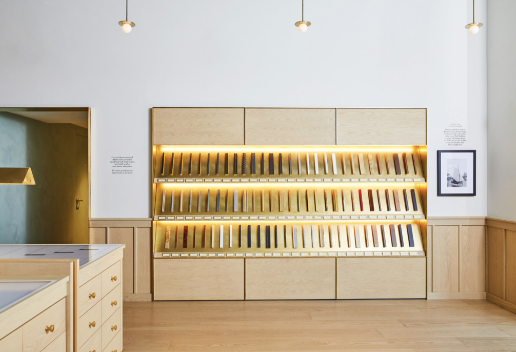
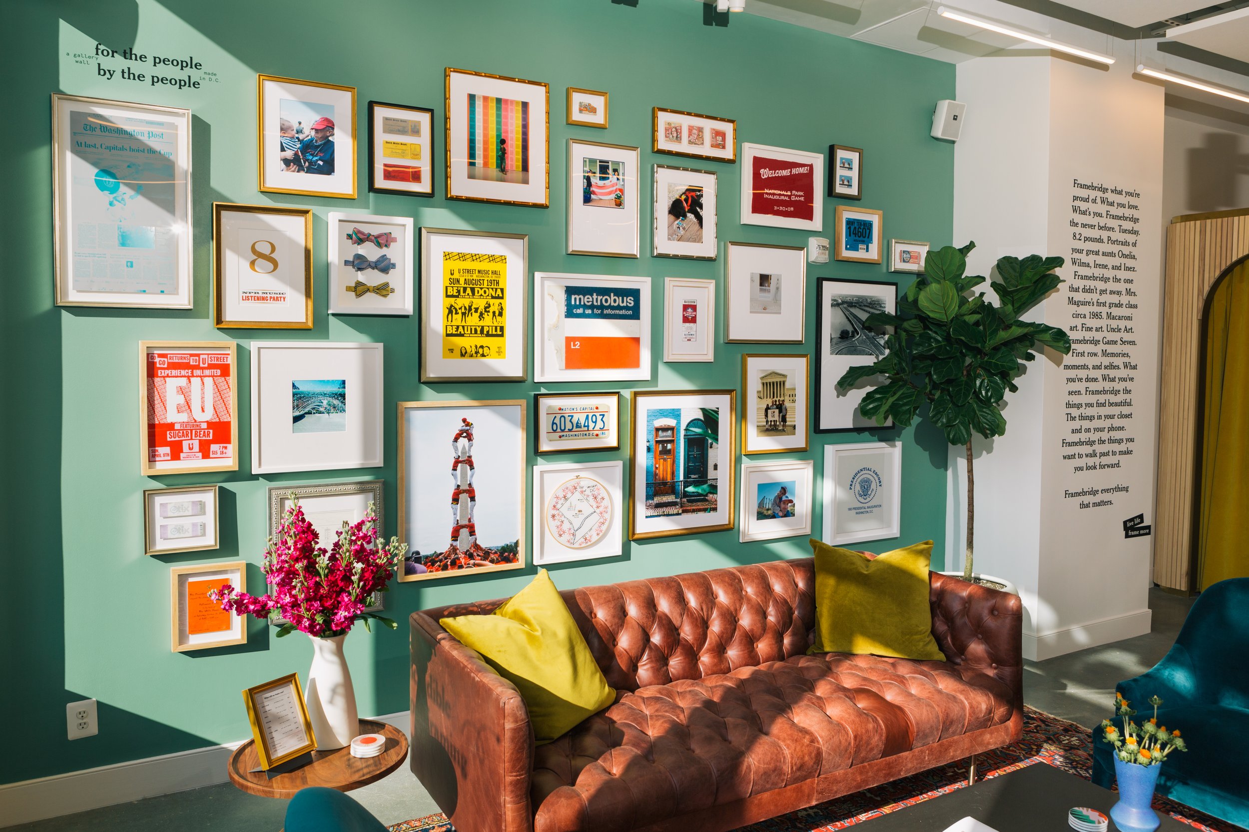
Every Framebridge store includes unique, detailed brand touchpoints: A “Things you can Framebridge” gallery wall of sourced local ephemera, a touch-and-feel moulding display, oak workstations with tabletop pricing grids, and "fancy mailboxes" for front of house / back of house pass-through and secure art storage.
2nd Design Iteration: Williamsburg
2nd Design Iteration: Williamsburg
2nd Design Iteration: Williamsburg
2nd Design Iteration: Williamsburg
2nd Design Iteration: Williamsburg
2nd Design Iteration: Williamsburg
2nd Design Iteration: Williamsburg
2nd Design Iteration: Buckhead
2nd Design Iteration: Williamsburg
2nd Design Iteration: Buckhead
2nd Design Iteration: Buckhead
1st Design Iteration: Bethesda Row
2nd Design Iteration: Buckhead
1st Design Iteration: Bethesda Row
1st Design Iteration: Bethesda Row
1st Design Iteration: 14th Street


